


This is the final article layout for Louise Fili, I tried to make it elegant, at the same time add a little bit of who she is in the piece. Since she was such a genius with typography I made I worked a personal sign with her name. I incorporated Italy there since it was her main source of inspiration, also I added calligraphic boarder for her works (since she loves using that in her work), and I chose the color platte based off her blog, and do be honest this was my first time working on Indesign and I think I did rather well. I made sure the layout wasn’t too flash, since she is quite old fashioned, with her workOverall what I wanted to communicate in this blog was that Louise Fili is a brilliant typographer who is an elegant and classy lady.
 This is my final design of the book cover, “Spontaneous Foobar Influencer”, what I did was do a compare and contrast. On Garry’s side is dark and ominous, showing that he’s under depression with the dark and messy line work. Not only that it shows his girlfriend falling and committing suicide that caused him depression. And on the right side we have Whisper and he outlook on life. As you can see she’s surrounded by colorful pixels (representing her colorful outlook on life) and her frame is white and I added a computer code on her background to balance it out and to tell the viewer that she’s a computer program.
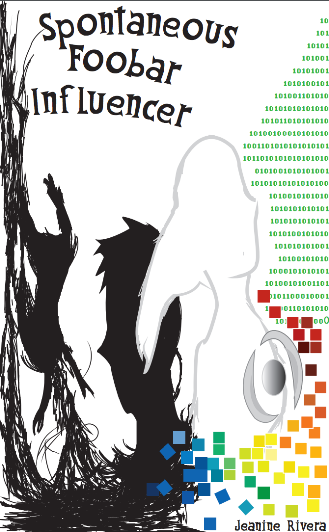


